Happy weekend! I know it has been a hot second since my last post, but I promise it is because I have a lot of great stuff coming your way very soon. I have also been giving myself the time I need to adjust to this whole working mom gig, without feeling like I always have a computer in front of me when {jv} is asleep. Thank you for bearing with me ;)
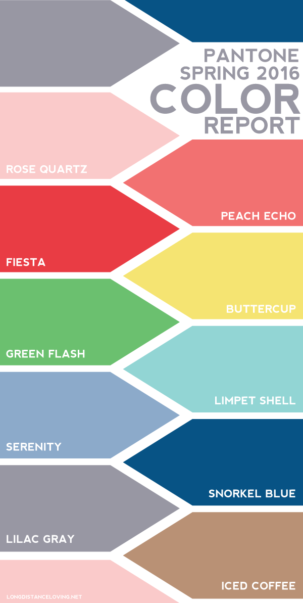
It has become a bit of a tradition for me to illustrate each spring's Pantone Color Report. I like to see how the colors all work together, as well as how they vary from year to year. (See for yourself -- here are the reports from the last three years: 2015, 2014, and 2013.) While Pantone hasn't released the color of the year yet (I'll update this post when they do), I don't see any runaway surprises like last year's Marsala. I think this year's top ten colors are a solid mix. Some years, the colors are all very muted or extremely bold. I actually like that there is a little of both for Spring 2016.
What are your favorites from the bunch?
I'm loving on the classic blue with a muted finish, Snorkel Blue, and the bright and bold red, Fiesta!
Lots more soon! xoxo {av}
Lots more soon! xoxo {av}

